You’ve acquired a Nummax LED display for your storefront and now you’re eager to be able to broadcast your offers and promotions to attract customers. You need graphic design.
You can use the services of a graphic designer to compose your messages or manage the content creation yourself. But hey, you’re no graphic designer ; )
Even if you own different authoring or editing software, like Photoshop, PowerPoint, CorelDraw or others, it doesn’t make designing any easier. There are a few basic rules to follow.
Nummax would like to provide you with some practical advice to avoid common mistakes. And to help you quickly create montages, in the 3rd part of this article we’ll include some templates for different software that you can modify and export as images.
To get down to the nitty-gritty, we suggest that you watch this training video to find out how to create content with PowerPoint.
Know the location of your audience and your Nummax display’s features
Knowing how far away your audience is from your display is crucial.
Depending on the distance, you’ll have the freedom to put more or less information into your content.
Whether your audience is a few meters from your window or at the end of a parking area will change how your message is perceived.
If your audience is on the move, it’s also a key factor. Those seeing your message from a moving car will get a few tenths of a second to understand it, while pedestrians in front of your window will have the freedom to gaze at your content for a longer period of time.
Your Nummax equipment has features that you should know about, such as its dimension in pixels and its pixel pitch. For example, ths LED Pro Poster has a 4mm pixel pitch and pixel dimensions of 160 x 240.
The pixel pitch enables you to know what the minimum text height should be (more details can be found in the 2nd part of this article) and the pixel dimensions will be the measurements of your content to create.
We recommend that you create content in the final pixel dimensions of your display.
Avoid composing HD (1920×1080) content for publishing on a 160×240 pixel screen. You’ll end up with files that are larger in KB than necessary, therefore taking longer to upload and load into the display. In addition, when you allow the software to adapt the dimensions automatically, the result is not always correct (fonts distorted, images stretches, etc.)
Graphic design: Mistakes to (easily) avoid
Here are some images of mistakes you can easily avoid.
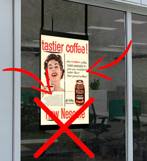
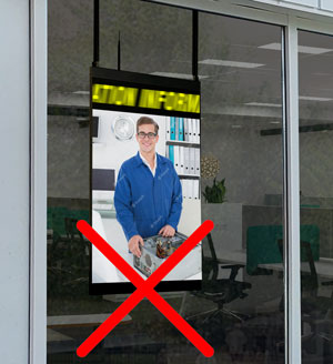
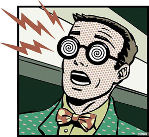
Too much text, and text that is too small compared to your pixel pitch.
The more text you have, the less people will read it. Depending on the size of an LED display’s pixel pitch, you shouldn’t use lettering that is too small. The letters will be distorted and text will be unreadable.
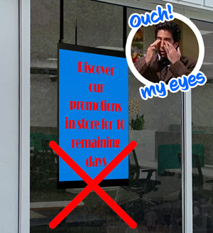
Wrong choice of colour for the message-background contrast
A high contrast is good, but not with just any colour. Avoid red-blue, red-green.
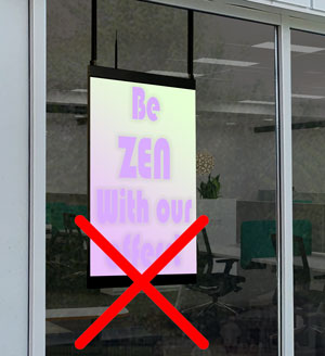
Contrast too low
Even if your message is readable up close, it will be less readable from a distance and when your screen’s brightness is very low or very high. An artist test is to squint your eyes and look at your composition through your lashes. If your content becomes unreadable, change the colours.

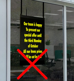
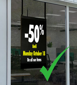
An advertising or marketing message should be concise.
Language can be very rich in formulas, metaphors and parables, but when the time comes to communicate something, be direct and get straight to the point..
Animated text: Scroll speed too slow or too fast
In the first case, your customers won’t receive your message because even from the sidewalk, they won’t stand for more than 3 seconds in front of your display. And in the second case, it’s just too fast for them to have time to read. Find the balance!
Contrasts
It’s important to choose a strong contrast so that your message can be seen and read from afar, but choose a combination that isn’t too harsh on the eyes.
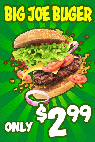
Here are some widely-used contrasts in signage:
Contrasts with white or black text:

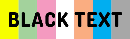
More generally, all bright colours on a white background work well.
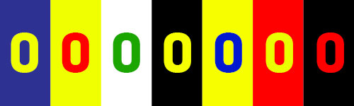
Some effective contrasts with a combination of colours:
Lastly, here are contrasts to avoid because they’re unpleasant to the eyes, or too weak.


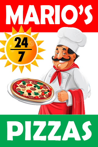
Backgrounds
You must choose a background that highlights your message and your message’s illustration.
Here are some examples of compositions and backgrounds that you can use with text.


Now that you’ve seen the mistakes to avoid, have assessed the importance of contrasts, and understand your display’s features, you’ll be ready to create impactful content no matter how far away your audience is.
While waiting for the continuation in our next article, know that Nummax can offer you a content composition service for your displays as well as manage the publications. Find out more!
To be continued…
